Web Development recently got a whole lot easier (and you might not have noticed yet)
A lot of things that required hacks, workaround and custom code are now supported natively in all major browsers. We take a look at them.

Less code is always better (Photo by Etienne Girardet on Unsplash)
Now that the security and support lifecycle for Internet Explorer 11 has officially ended with only special long-time-support environments for enterprises remaining, IE is finally dead for the common end-user. All remaining browsers with a notable market share receive regular updates automatically. Even Apple now introduces support for new web features in minor Safari updates over the year and keeps major Safari updates available for some older macOS versions.
For web developers, that means that they can really limit active support to the last 2 major versions of all browsers and still be sure that the vast majority of their users is covered. If you already have a web-based product, it’s of course always better to check the browser usage of your users for yourself in your analytics solution, before making a business-critical decision to drop support for certain browsers.
With frequent version updates, browsers regularly gain support for new web features, that often inspire thoughts like “This will be nice to use in five years, when it’s supported by all browsers”. The moment when the browser support is actually there, often goes unnoticed in the ever-flowing stream of web development updates and new JavaScript frameworks though, so unless you regularly go through all major browser changelogs, chances are that you have missed out on features that can safely be used now and therefore make your live harder than it needs to be.
In fact, when I browsed through caniuse.com recently, I was very pleasantly surprised, which features are already broadly supported, because many of them can save the ordinary web developer a lot of work and replace solutions for common challenges that used to require a lot of hacks, workarounds, custom JavaScripts implementations or libraries with a one-liner. Nice! Let’s look at some of them.
Font Handling
Font Formats
Remember articles like the bulletproof font-face syntax? There used to be up to five different file formats necessary for custom web fonts to display them in all common browsers in the early 2010s, along with a complicated chain of font source URLs that no-one could ever remember, so we used tools to create them for us. Eventually, people just used Google Fonts, which next to the font files itself, would create the matching font face CSS for you, based on the browser that made the request.
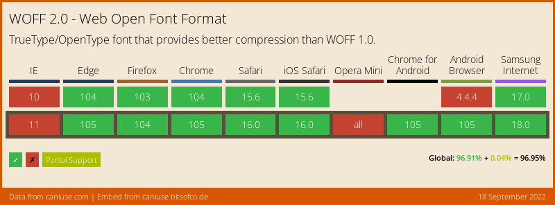
There are legitimate reasons to host your web fonts yourself though, which thankfully is a lot easier now, because WOFF2, arguably the most capable web font format, is now supported in all major browsers.
Chances are, that you also don’t need multiple WOFF2 files for different font weights or styles anymore, because variable fonts are a thing now, and they are also supported in all browsers.
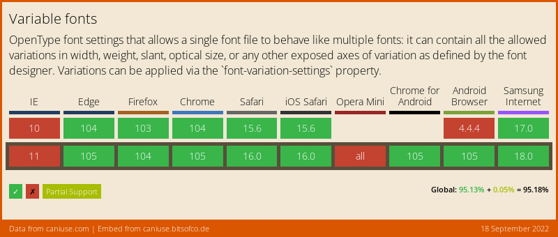
So if you used to have a web font in three weights or variants, times five formats, that made 15 font files necessary plus CSS to load them correctly. Now you only need one.
Font loading
Even if we only have one font file to take care of, it is still an additional resource that must be downloaded by the browser. A few years ago, it was not easy to control what would happen during that font loading process. It was not uncommon to see no text at all on a website until the web fonts had finished downloading (also called the FOIT = Flash of Invisible Text). This is a suboptimal user experience and makes the overall site loading feel slower than it is.

FOIT on medium.com (generated with webpagetest.org)
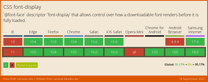
People noticed this, so multiple 3rd party scripts came up that you could use to control your font loading behavior. Still, this was quite a bit of blocking JavaScript code that you had to embed on your page, which again increased your page loading time. Today, all of this is not necessary anymore. We now have the font-display property that tells the browser how to behave until a web font is loaded. A sensible default is font-display: swap, which immediately shows the fallback font and then switches to the web font once it is loaded. This way our users get to read text on the page as quickly as possible.
Different font families have varying letter widths, so there might be a content shift when the font switching happens. In order to prevent this, we can apply some CSS to match the fallback font size to our web font as closely as possible. Font Style Matcher/ is a great website that lets you visually match fonts in a fast and easy way.
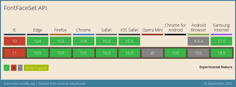
Now we need to know when our web font finished loading to remove the custom font matching style. There now is a native Font Loading API in browsers that lets us know when a font has finished loading. This way we can implement a user-friendly font loading behavior in very few lines of code:
// in your JavaScript:
await document.fonts.ready;
document.body.classList.add('font-loaded');
// in your CSS:
@font-face {
font-family: 'MyFont';
src: url('fonts/my-font.woff2') format('woff2-variations');
font-weight: 400 700;
font-display: 'swap';
}
body {
font-family: 'MyFont', Arial, sans-serif;
}
body:not(.font-loaded) {
/* adjust the font Arial to get a text block size close to
the one of "MyFont" to prevent layout jumps when "MyFont"
has finished loading */
letter-spacing: -0.05em;
word-spacing: 0.02em;
}
Loading and Displaying Images
Images are very often the resources that make up for the majority of the traffic necessary to display a web page. Depending on the image size and internet connection speed it can take quite some time for all images to finish downloading.
One nasty attribute of images on the web is that the dimension of an image is only known to the browser when the headers of the image have finished downloading. If you don’t manually provide an image size via CSS, the image will take up zero height until its dimensions are known, which can cause parts of the page to suddenly jump down when images above them are downloading. This so called „cumulative layout shift“ poses a bad user experience and can even cause users to click on an entirely different thing than they wanted to, if between clicking down the mouse button and releasing it parts of the page have moved (imaginary nod if you have been annoyed by this before).
So generally, when loading images, we want to ensure four things:
- Only images that are visible or become visible soon, shall be downloaded to not waste traffic (so-called lazy loading)
- Images should be downloaded only in the size they are displayed at
- The image is displayed in the correct size for the current viewport
- While downloading an image, there should be no page jumps
For lazy-loading images, web developers used to include custom JavaScript code that would constantly check if an image has entered the viewport to only then set its image source URL, so that the browsers started downloading the actual image.
Nowadays, this is as easy as adding the attribute loading="lazy" to the image tag. No JavaScript needed at all.
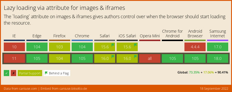
The partial support refers to missing lazy loading supports for iframes, lazy-loading images is supported in Firefox and Safari as well.
In order to prevent page jumps when downloading an image, its size can be set manually in advance if it’s known to the developer. In the days of responsive design, we often want to size the image based on the viewport size, say to 100 percent width of the content column, while retaining its aspect ratio. This aspect ratio aware scaling wasn’t too easy to achieve until recently.
Via CSS this could be achieved with a hack, leveraging the fact that a percentage-based padding value always relates to the width of the element, even if it’s set on the vertical axis. This way, one could size an image like this to maintain a 16 by 9 ratio:
width: 100%;
height: 0;
padding-top: 56.25%; /* 9 / 16 * 100 */
However the zero height and padding could cause issues in combination with other styles, so this was never a great solution.
Today, we can simply use the aspect-ratio property:
width: 100%;
aspect-ratio: 16 / 9;
Much simpler to read and understand and with less side-effects. Great!
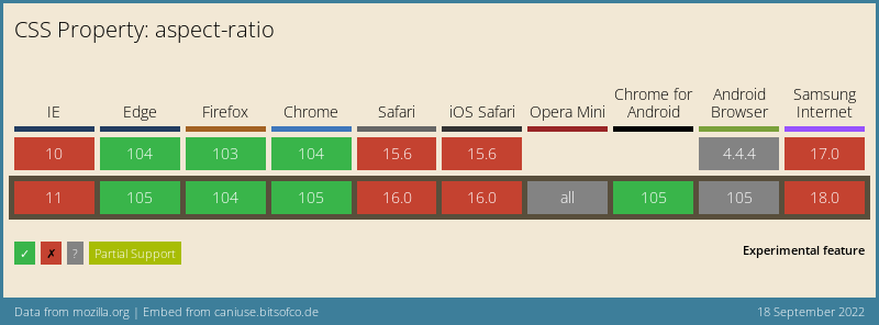
Aspect-Ratio is supported in Safari since v15, the Caniuse chart here doesn’t seem up to date.
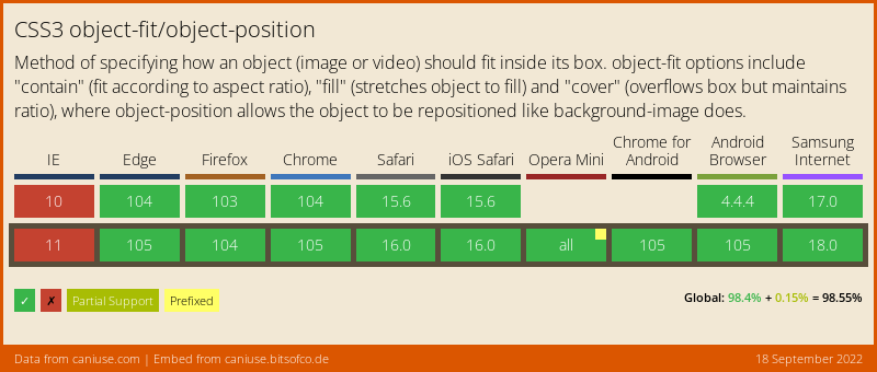
For some responsive layouts, we might want to display an image in another than its original aspect ratio. This wasn’t possible to do with <img> tags for a long time, as the image would become skewed or distorted. Developers instead used simple divs and set the image as background-image, of which the behavior could be controlled with the background-size and background-position attributes. In terms of semantics and accessibility, this is no good solution though if the image is actually part of the page content and not just decoration.
Today, we simply can use the object-fit and object-position attributes on images directly to achieve the same behavior.
In terms of image formats, there has been some progress as well. While the <picture> element has been supported for a long time to load the best suitable image format for the browser, there are two areas where almost ancient image formats are still prevalent on today’s web: favicons and animated images.
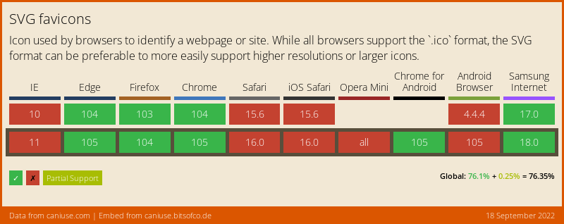
The favicon.ico is a relict that we just can’t seem to get rid of. Not only is the ICO format very limited in its capabilities (limited color palette, no alpha transparency), it’s compression is very weak as well. Many favicon generators generate .ico files that contain all size variants of the favicon together: 16x16px, 32x32px and 48x48px. This sometimes can produce a file up to nearly 100 KB size, just to display a tiny icon. The topic which favicon formats are really needed nowadays, is discussed quite often among developers, and almost religiously so, with varying opinions.
A quick test of mine with all current browsers has shown that all of them display a 32x32px PNG favicon just fine, which should be all that we need, if we don’t have any exotic clients to support. This gives us a much smaller file with better image quality than the good old ICO file and we don’t need to rely on random websites to generate multiple favicon files for us.
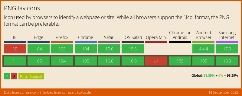
If you are really into image quality, SVG favicons can be really useful too, as they can be made adaptive to support a dark mode when including a bit of CSS into the SVG. Sadly, only the latest Safari version 16 supports them, which is not really widespread yet.
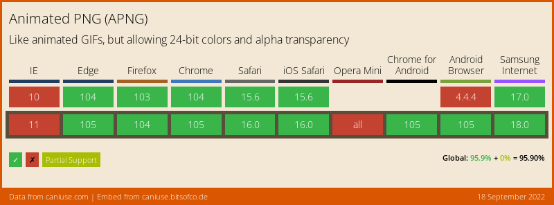
For animated images, we have had the GIF format for a long time (or is it pronounced JIF? 😜), but like ICO, the format is severely limited in many ways: low color depth, no alpha transparency as well as a limited duration and frame rate.
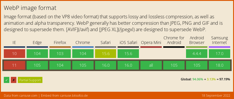
Both APNG and WebP are much better alternative formats, which both have complete browser support. In fact, even Giphy (despite its name) now serves WebP files by default to all major browsers. The tools to generate these modern image formats are rarer than GIF creators, but they do exist.
If you aren’t turning any video footage into animated images, SVG animations could also be a great option for you with a possibly much smaller file size.
Scroll Effects
At some point in the 2010s, scroll effects became very en vogue to a lot of websites, especially in marketing related sites like agency websites or product pages, that gave us a lot of teasers filling the viewport, while overriding scroll behavior to just allow the users to scroll the previous or next teaser into the viewport. A related, but less annoying thing that could be seen on a lot of website were content sliders, that showed one piece of information at a time and could be navigated through, often horizontally, to slide in new content that would push out the previous information.
Since the was never a standard implementation of both behaviors, we could see many different, often buggy or laggy implementations using a lot of custom JavaScript or bloated libraries.
While overriding scroll behavior and not letting users scroll around freely is generally something you should avoid, if you have to do it, you can now leverage the CSS scroll snap attributes for it, which let you determine what part of an element should be scrolled to and whether to always snap-scroll to it or only if the user has scrolled to the immediate proximity of the element.
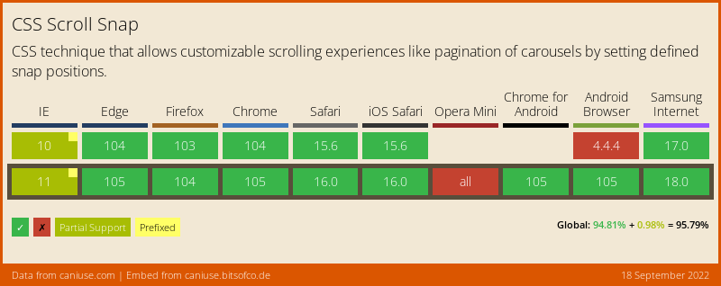
Content sliders can also be implemented much easier using this technology.
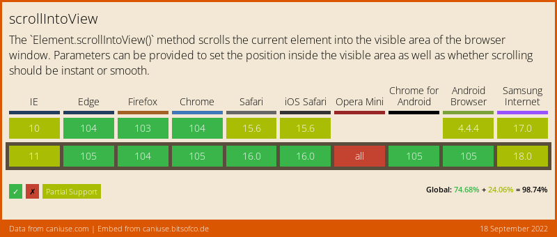
The last thing we also want to achieve regularly, is scrolling to some point of the website in an animated fashion after a user interaction, e.g. after pressing a “back to top” button. This can now be down easily with one line of code using Element.scrollIntoView():
document.body.scrollIntoView({ block: 'start', behavior: 'smooth' });Please note that smooth scrolling is only supported in Safari in the newest version 16. Previous versions will still scroll there, just not in an animated fashion.
Page Layout
Gaps in Flex Layouts
Luckily, with flex and grid layouts, we don’t have to worry about how to center things anymore, but some things remained quite difficult up to now.
Having uniform margins between elements in a flex layout could turn out to be a pain, especially in responsive layouts, where elements could wrap on some viewports. A rather flexible way was to apply consistent margin in all directions of the flex elements. That would however also produce a margin to the border of the container, which is often unwanted, so a negative margin had to be applied on the container to visually even out the margins of the child elements. This however could again lead to issues with the parent element of the flex container.
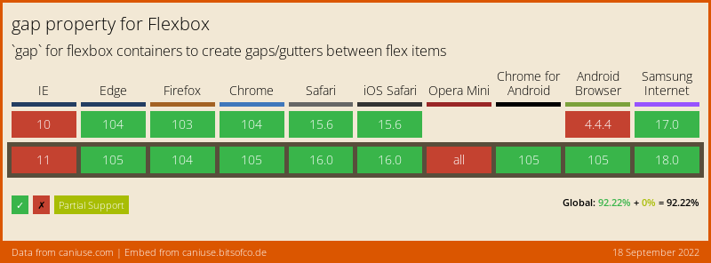
CSS Grid Layout introduced the gap property later, which solved this issue, as it only added spacing between the grid elements, but not at the beginning and end of the grid axes. Sometimes using grid is a little overkill for simple layouts, so thankfully the gap property has made its way to the Flexbox layout too by now with cross-browser support.
Intrinsic Element Sizing
There is another improvement that was introduced with CSS Grid Layout that is now available outside of it: Intrinsic element sizing. This rather complicated term means that you now can set the dimensions of an element to the size that its content takes up. Let’s demonstrate this using the width property:
width: max-contentis the width the content would take up without wrapping to multiple lineswidth: min-contentis the minimum width that the content can take up when its wrapped, which would usually be the width of the longest word (if hyphenation is disabled)width: fit-contentuses the smaller width ofmax-contentand the width of the container
This is especially useful if you are creating reusable components with variable content that you can’t know the length of in advance.
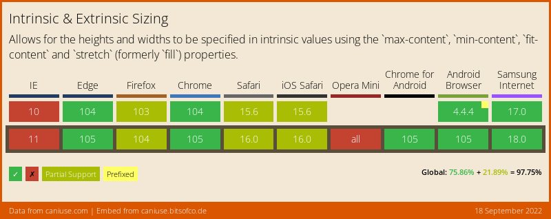
min/max/fit-content are supported in Firefox and Safari too, limited support refers to other values
Direction-Aware Sizes and Margins
If you have ever worked on an internationalized application that needs to support languages with different text directions, you know that this can make layouts with CSS much more complicated. Say you have a button with a text label and an optional icon before the label, and you want to add a little space between the icon and the text label.
If you cannot rely on the gap property in grid or flex layouts for spacing out elements and need to use good old margin and padding, just using margin-right on the icon would seemingly do the trick, but that is only true for left-to-right, top-to-bottom languages such as English. For Arabic text which is right-to-left, top-to-bottom, the icon would appear right of the label, so the margin would be on the wrong side. For Japanese that is read top-to-bottom, right-to-left, it would be even different.
You could override the margin direction for the different languages, but doing that for every element would be a lot of effort. Gladly, there are properties now that take text direction into account:
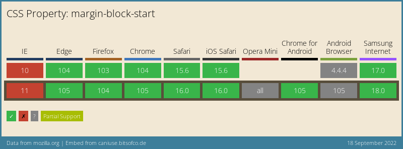
margin-inline-start and margin-inline-end work in the primary reading direction of the text, so in a left-to-right, top-to-bottom language such as English they would correspond to margin-left and margin-right. Conversely, margin-block-start and margin-block-end work on the cross-axis, so the would correspond to margin-top and margin-bottom in English. With these you don’t need any overrides anymore, as they adapt to the reading direction automatically, e.g. margin-inline-start would be equivalent to margin-top instead of margin-left in Japanese.
For sizing elements, there are similar attributes: inline-size and block-size can replace the width and height properties respectively.
Environment Variables
When Apple introduced its first iPhone with a display notch in 2017, it posed the challenge that the notch could obscure parts of a web page when it was viewed in landscape mode in full screen. By default, Apple just shrank down the viewport horizontally in landscape mode, but wanted to give developers the option to make use of all the display space possible with a special viewport meta tag. To account for the notch, Apple introduced CSS constants for providing the insets for the safe area inside the viewport, that would never be obscured.
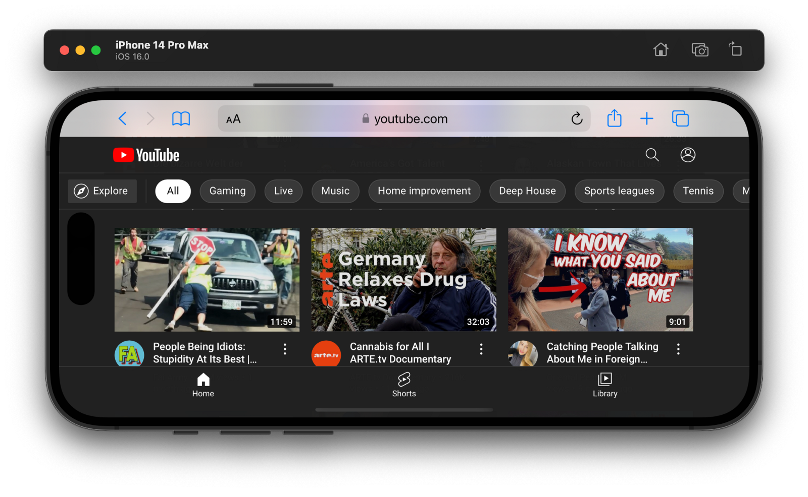
the YouTube web app uses the full viewport with safe areas for the camera hole and app switcher bar
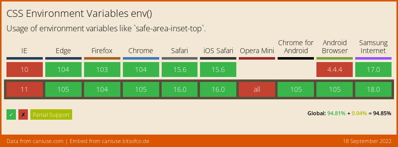
This has evolved into the official CSS environment variables standard that is now supported by all major browsers. It can also be used for progressive web apps that are launched in their own window on desktop computers to account for the window control buttons in the title bar.
Summary
We have looked into some new modern web features in the areas of font loading, image optimization, scroll effects and page layouts that recently gained cross-browser support and are now safe to use in web projects.
I hope that you find these tips useful and that they help you to solve some problems quicker and with less code in your next project.
As the article turned out fairly long already, I couldn’t even include more HTML and CSS advancements with recent cross-browser support, notably new CSS selectors, user interaction and form elements as well as visual appearance and theming, which will likely be part of another future article.